Wednesday, 11 December 2013

Action plan for the Music Magazine

Before starting a new project - The Music Magazine - I need to plan WHAT to do and WHEN to do it. This action plan and dates of deadlines will help me to get my work evenly distributed through the weeks and get everything done on time. 

Week 1- 9.12.13
  • Post an action plan
  • Create a magazine comparison chart

Christmas holidays - 16.12.13 - 06.01.14
  • Notes on magazines and photography
  • Create a photoshoot plan
  • Do a photoshoot

Week 2 - 07.01.14
  • Textual analysis of cover and contents pages
  • Finding out circulation and readership figures
  • Create audience questionnaire and analysis of it

Week 3 - 13.01.14
  • Practice sessions on Photoshop and InDesign
  • Manipulation of photos
  • Poll on magazine names

Week 4 - 20.01.14
  • Notes and/or videos on use of fonts and colour samples
  • Create layout designs
  • Do the treatment sheet

Week 5 - 27.01.14 and Week 6 - 03.02.14
  • Create at least 3 drafts for each page
  • Write DPS, cover lines and content

Week 7 - 10.02.14
  • Post final pages
  • Start audience feedback

Half term - 17.02.14
  • Continue audience feedback
  • Write an evaluation of work 

Week 8 - 24.02.14 and Week 9 - 03.03.14
  • Final redrafts and corrections to the work

Deadline Friday 7th March - Sign off


InDesign

Before starting working on the Music Magazine we had a introduction lesson to the InDesign. It is similar to the Photoshop, however, it is better in a way as you can frame everything you do, especially the pictures. This is what we did and it was really easy:

I think it will be easy for me to combine text and pictures fo my Music Magazine using this programme and wil save me some time. It was pretty simple to put the text in columns and place pictures that way only by framing them. Working in InDesign makes pages look more professional in my opinion and neater. 

Final post - Student magazine

So I say goodbye to the Student magazine. Working on it gave me a lot of new skills, such as working in photoshop, and it gave me an idea on how to plan work on my music magazine, get everything ready on time and make it better. Soon, the work on my music magazine will start and new posts will appear.)

Monday, 9 December 2013

Evaluation


Now that I've uploaded my final pages, I've evaluated my whole work done on them. I've been given questions which helped me to do the evaluation and here it is. 

In what ways does your media product use, develop or challenge forms and conventions of real media products?

A successful cover page of any magazine has to have a main picture that will relate to the theme of the magazine and suggest in a way what audience it is aimed for. The musthead has stand out and so be in bold font and some contrasting colour.  The cover lines have to tell a little bit more information on the insides of the magazine, but not too much – just enough to get the reader interested. The cover should give some information about the magazine, such as number of issue or month of issue and price. Little advertising should be added in a form of a website of the magazine. The most interesting and important cover lines should stand out more than other. Almost the same applies to the contexts page – pictures of the main articles, eye-catching fonts and colours, easy to read texts and page references.
Creating cover and contents pages for a student magazine, I’ve considered some issues that have to be applied particularly in this case. First of all – the main image. From the first look at the cover it is clearly seen that my magazine is for older students, as my model looks as an A-level student. Also the crest I’ve used relates to a particular college and in a way works as an advert for it. Simple and straight lines of the musthead and cover lines suggest that the magazine is serious and again – for and older audience. However, bright colours of the cover lines show that this has a bit of fun and also helps them to stand out well. As was voted, my magazine is free, and so I showed this in big red eye-catching letters so that all the information is there for the reader. The contents page played on the contrast with the cover page. It is simple and straightforward, nothing confusing, all neat and clear. Once again, all the information given is just enough to make the reader turn the page.
The main difference of my cover is that usually magazines are light and bright, whilst mine is a dark picture. However, it is the face of my model that is highlighted and the picture is very attractive and grabs attention. Also, some may say that something is missing and I need to add more, however, my main idea was simplicity and even a form of minimalism and I feel I’ve succeeded in that.

How does your media product represent particular social groups?

First and most important – pictures. I have only two pictures but both are of the sixth form students. This shows that my magazine represents not teenagers in general but aimed particularly at students. Both models are smiling very naturally and I think I’ve managed to catch real positive emotions in those pictures and this will help to attract the audience. Also the language and cover lines are not very complex, sometimes even chatty (e.g. “what’s up’’) and this also shows the relation to the young people. Overall, the magazine represents older students in our college, they look happy and relaxed which is always good for students themselves and for advertising the school.

What kind of media institution might distribute your product and why?

As it follows from the name and the crest, this magazine is aimed particularly for St. Edmund’s College. This suggests that it will be published in small numbers and distributed around school and it’s students, and surely one issue will be always available in the library. However, this magazine can be adjusted for different schools or even universities. With a change of articles and probably development of the name – E.T. university edition or E.T sports – it could become widely spread and increase its audience.  The magazine has a lot in it and everyone will find something interesting for himself or herself. This is a question of development as more subjects could be added to it.

Who would be the audience for your media product?

My target audience is older students. I would probably start with teenagers aged from 15 and over. My magazine has advises on revision techniques for the exams, such as GCSE and A-levels. It is also largely aimed for female. Even though when starting the magazine I wanted it to be aimed for both genders, I’ve ended up with all female models and female related cover lines and articles. There is no stereotypical member of the audience my magazine is aimed for, however it is easy to imagine that young students will be interested in everything new, in media and technologies, news, health, school events and ways for better studying, and also fashion and art as this magazine is targeting females.

How did you attract/address your audience?

First of all the cover of my magazines shows what audience I am aiming for.  I believe that the picture itself will attract a lot of people to it and the fact that my cover looks a little bit dramatic will interest the person passing by and she will stop to flick through pages. This particular issue will interest audience as there are articles and pages dedicated to Christmas, and this is the main focus at this time of the year. And probably one of the major reasons why a lot of people will read the ‘’E.T.” is because its free! Students will take them, read, tell a friend, share and so the numbers of readers increase.
If I were to increase the audience I would probably add more masculine thing into the magazine to grab male students attention. However for now this is a female student magazine, which anyone can read for free.)

What have you learnt about technologies from the process of constructing this product?

I’ve used my own camera, which I am used to, however setting up the photoshoot was an interesting and fun experience. Adjusting the light and working in half-dark room was dangerous as I kept tripping over the wires and furniture, as well as trying to get a good shot and avoid a very hot lamp at the same time. But my struggles continued further. It was my first time I was working properly with the Photoshop and I didn’t get everything from the first time. Now I know some basic tools and can edit a picture and make it look very good (I think).  Also, printing pages and pages of questionnaire almost broke the printer however I’ve managed to do it in less than an hour and analyse my results. Before putting any text in my post I’ve typed it in Microsoft Word, tried to correct all the mistakes. After all these difficulties the final step was to upload my Photoshoped pictures and text to the Blogger. Now, as I’ve finished this practicing part of my coursework, I understand how hardworking and patient people creating magazines are. Obviously they are professionals and have more experience than I do, but that just shows their level of skills and that I have to learn so much more before I start my music magazine. Overall, I do have basic skills for creating a magazine and it was a good and helpful experience.  
Final draft - Contents


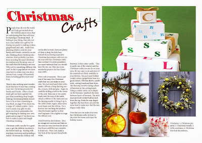
Below is my final draft of the contents page for my student’s magazine. It is totally different to my previous draft and much more simple.


 I wasn’t particularly happy with how my previous draft looked like so I’ve researched contents pages of different magazines – fashion, sport, science etc. etc. – and noticed that most of them tend to have almost the same layout from issue to issue. Usually it something simple, with image and text around it or 3 -7 smaller images with text above or beneath each of them.

For my final draft I’ve chosen the picture from the first draft however it smaller now and based on the white background. Also:
  • ·      I’ve put the name of my magazine in a big handwritten black font. It stands out a lot on a simple white background and is different to the one on the cover page.
  • ·      I was influenced by fashion magazines – a lot of them put the masthead in big font and the fact that this is a contents page above it, in smaller simpler font. Even though this is a students magazine, not a fashion one, I though this is a good idea, it looks good on my cover page and stands out very well, despite the small size of the text.
  • ·      I’ve also noticed that a lot of magazines divide their contents in groups by themes. So did I. I’ve used the same sans-serif font for both subheadings and pages reference’s but different sizes and colours.
  • ·      The whole page has 3-colour writing on it – red, black and white. I thought these colours will stand out a lot on a white background (and white on a dark photo) and also they reflect the colours on the photo. They don’t look overwhelming and too much and the text is easily read. 
  • ·      In my last draft the editor letter was somewhere in the end, according to my contents. However, I realised that usually it is put at the very first pages of the magazine, between adverts and contents pages. 
  • ·      All the headings and writing are in a straight neat and nice column. They are easy to read and balanced with the image. Also, the picture and text don’t distract the eye of the reader from one another.
  • ·      I’ve put the page number of the interview on the actual picture of the model. This sends clear message to the reader who is the interview with and about and doesn’t need any explanation. Also the white colour of the text stands out and contrasts with picture but echoes the background.
  • ·      I’ve also added the advert of a mobile version of the magazine and the website, as this is also often seen in the real magazines.


Overall my idea was to KEEP IT SIMPLE.  I’ve tried to create a balanced and eye-catching page, which will be easy to read, give all the needed information, but not too much. Also, I’ve focused on the ways to make the reader READ the magazine, not just look through pretty pictures. Once again, this page looks as a contents page for a magazine that aims for older students, what is exactly what I wanted. In a way, it even looks classy – straight lines, simple colours, one big and good picture and a heading that stands out. Being honest – I like it!)

Sunday, 8 December 2013

Final draft - Cover

After struggling with photoshop for a long time and all the attempts to be original and creative finally the newborn cover page of the "Edmundian times" is here. 


Must say, I am pleased with my work and proud of myself. I like what I see and I feel it is interesting and quite close to a real magazine cover.

Compering to my last draft this one looks better and has those little details added that are so important.
First of all, I've kept the general layout the same as previous time, however some changes took place:
  • The masthead - it is still white and stands out on the background, but I've chosen the font with very straight lines, which makes it simple and serious. This is good as my magazine, following from the cover lines is aimed for older students.
  • The number of issue with month and year is still beneath the St.Edmund's Crest so no major changes happened there - only the font of the text.
  • Ive decided to keep all the colours of the cover lines simple and same to the previous draft. However, this time all of them are in bold underlined font which varies in sizes a little bit. I've done it to make some cover lines stand out even more than others. All the rest of the text on the page is in white.
  • My three main cover lines were put in one column on the left side of the page - this looks neater and balances the overall look of the page.
  • I've decided to put something that would be related to my main picture, something like quote, as you can see, on the right side of the page. In the real magazine there is usually a cover line that is related to the model on the cover page - so by adding a simple quote with a name I am one step closer to the real magazine.
  • Another change was the barcode. Instead of having a white rectangle with black bars on the dark background I've put the one that has white bars and numbers and contrasts the page. 
  • I've moved the website address closer to the left and in the bottom right corner put a diagonal sign, telling the readers that this magazine is for free. It is in a bold red font and massively stands out from everything else on the page. 
Overall, I've kept my cover page simple, in bright and contrasting colours, trying not to put too much of everything on it. I do have those little details a real magazine cover will have, and even though it is surely not perfect or ideal it is a good try and I am happy with it.)

Friday, 6 December 2013

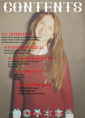
Second draft - Contents

This is my second draft of the contents page:


For this contents page I've chosen a picture of Donna and faded it a little bit so that I could put text over it. This is what I've managed to do while working on this page:
  • As I've already mentioned, I've faded the picture and used it as a full sized background.
  • Across the whole page I've put a heading ''contents'' in a white capital letters in big font - it is bright and stands out good on a coloured background.
  • I've used same fonts for cover lines and red colour. They look bright and neat as there is not too much of different writings.
  • Same with the writing below cover lines - all in same font and same colour. I thought that real magazines wont overuse different styles of fonts and stay simple highloghting the main points.
  • I've put the coverlines in a slight diagonal to fill up the space however, it doesnt look very neat and sometimes it is hard to read.
  • The last thing I've put on my contents page is little blue snowflakes and ''Christmas edition'' in red on top of snowflakes, however once again it is pretty hard to read so I need to think of changes for the next and final draft.

Wednesday, 4 December 2013

Second draft - Cover

So, I've imroved my photoshop skills and added more details on my drafts of the cover and contents pages.


This is my second draft of the cover page. I used the same picture, but I've tried to make it look like as close to the real magazine as possible:

  • First of all I've changed the font and colour of the masthead. Now it is white and looks more serious and simpple. I thought that white and black will contrast very well and also, th ereal magazines usially choose a font with straight lines and nothing very extraordinary and with massive detailes.
  • I've also decided to live the crest on the cover and I've rote the number and date of issue underneath it as usually this is written somewhere in the upper corner of the magazine.
  • For the cover lines I've used three diffewrent and quite bright colours which can be also seen on the crest. Also different fonts were used for the cover lines,contrasting with the background and highlighting the different themes of the issue. All the rest of the writing is in smaller white font. 
  • The barcode at the bottom left corner adds realism to this cover page as well as the webside in the right corner.
Overall, I've tried to keep it simple and not add too much colour. I like the idea of minimalism in a way, because than the picture stands out more and everything is balanced on the cover page.


First draft

I have done these pages to have an overall image of how my cover and content pages could look like. these are not really drafts as there is only the main picture and the mustheadon them. Ive chosen two pictures for these two pages:


I've chosen a picture of Daniela for the cover and added my musthead on it. I've used in a way a very artistic font in light blue colour. The letters ''E'' and ''T'' stand out a lot reflecting the name of the magazine. The color of the musthead also reflects the colours of the school crest which I've decided to add to represent the school and emphasise that this is a student magazine.


After working with this picture I've decided to stick with it and use it in all the further drafts and the final cover page. The black background allows to use any other colours for the cover lines and the picture itself is very cheerfull (even though dark colours are dominant) as the light is directed on Daniela's face and highlights all the emotions. It catches the eye but doesnt distract from other thongs on the cover.

I've also tried to do the layout of the contents page. For it I've used a picture of Donna. I've decided to use it in the maximum size and as an actual background for the page. I thought making it black and white would be a good idea, as I could use different colours for the headings of the contents. However, the picture appeared really dark and even depressing. This is a good picture as the placing of person in the shot allows me to write all the contents on the right side of the page in a nice neat coloumn. I think I can use this picture but work more on it, add effects and make it less dark and more interesting. 


Sunday, 1 December 2013

The photoshoot

We managed to have our photoshoot in the classroom. All we've used for equipment was a black background, a tripod and a light. Each of us had a camera so we ended up with a variety of shots. Personally I've been using this baby:


We decided on the black background rather than white as we thought that way the focus of pictures will be on people's emotions and photos will be ''alive''. Also we turned the main lights off so that only one light, focused on a person being photographed, remained. All this created a very special atmosphere and we achieved a good result. In pictures people are the main focus, their faces highlighted, true emotions are seen. And to add to this, we had a very fun time with only positive emotions.


Backstage fun

Last lesson we organised a photoshoot to take pictures for the covers and content pages of our student magazines. 

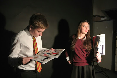
Usually people see only the covers, but what was happening backstage of the photoshoot remains hidden. So while everyone was taking pictures of their "models" I've decided to capture the process. Here are some of my photos. 


Wednesday, 27 November 2013

The E.T.

I was thinking about the appropriate name for my student magazine, something that will be original and familiar to the reader at the same time. It has to represent the college and link to it but also be something that comes from outside the college. It also has to be eye catching and create certain thoughts and associations for each reader. 

Here is an advert which pushed my idea to further development:


This is a very original, eye catching, in a way funny and very smart way to grab people's attention. Even though it is absolutely irrelevant to the magazines, the idea of using something already so familiar to people and use it in a absolutely different way as it is used to be thought of. 

All this thinking led me to this - the Edmundian Times magazine, or simply the E.T.

Originally E.T. stands for the Extra-Terrestrial, a 1982 American science fiction film co-produced and directed by Steven Spielberg. Few years ago a popular American singer Katy Perry released a hit with the same name. So I thought, it will associate with either movie or song  depending on the age of readers, meaning that everyone will find reasons to read it. Also, this is a perfect abbreviation that has Edmundian name in it. 


So, let the E.T. production begin and soon you will see the first pages of it!