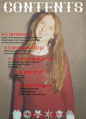
This is my second draft of the contents page:
For this contents page I've chosen a picture of Donna and faded it a little bit so that I could put text over it. This is what I've managed to do while working on this page:
- As I've already mentioned, I've faded the picture and used it as a full sized background.
- Across the whole page I've put a heading ''contents'' in a white capital letters in big font - it is bright and stands out good on a coloured background.
- I've used same fonts for cover lines and red colour. They look bright and neat as there is not too much of different writings.
- Same with the writing below cover lines - all in same font and same colour. I thought that real magazines wont overuse different styles of fonts and stay simple highloghting the main points.
- I've put the coverlines in a slight diagonal to fill up the space however, it doesnt look very neat and sometimes it is hard to read.
- The last thing I've put on my contents page is little blue snowflakes and ''Christmas edition'' in red on top of snowflakes, however once again it is pretty hard to read so I need to think of changes for the next and final draft.

No comments:
Post a Comment